I came across an old weaving pattern from the January/February 1994 Handwoven Magazine called “Winter Lichen Towels” by Jean Scorge. It featured two main aspects I wanted for my new project: 1) the twill color weave technique, and 2) a geometric/block design. These were not my usual preferences, but I was eager for a challenge and something different. However, the most significant challenge I faced with this project was creating a fresh color scheme to give it a modern twist.
Understanding color theory wasn’t easy for me, despite being creative. Picking colors that worked well together to enhance my projects didn’t come naturally. I usually preferred darker shades like black, navy, and charcoal because they felt comfortable to me. Mixing colors with similar darkness seemed safe, but it often resulted in losing the design’s impact. Even though I knew about primary colors and how they combine to form complementary, secondary, and tertiary colors, I still lacked confidence in choosing colors wisely. However, watching Gail Defrusne’s video “The Value of Values” changed my perspective. Her approach of considering values, or the darkness or lightness of colors, helped me select colors and plan designs more efficiently and effectively.
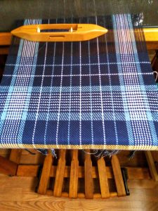
The original colors in the pattern were sage green, white, and charcoal. While I liked each color individually, the combination felt dated with this pattern. Instead of relying on the color wheel for inspiration, I chose to visualize the pattern in grayscale, akin to pencil shading. In the future, I plan to take a picture of the pattern and apply a black and white effect for a quicker reference. Then, I organized my stash of 8/2 cotton into dark, medium, and light tones. I opted for navy as the dark color, denim blue as the medium tone, and white as the light tone. The next step involved deciding where to place these colors within the geometric design to highlight the contrast between dark and light. In the border section of the pattern, I alternated colors every two rows (picks of weaving) to draw attention to this detail. Alternating navy and white, which offered the most contrast, seemed the logical choice. Seeing the prewashed finished towels, following the original weaving pattern, I’m thrilled with the result! It brings a refreshing update to the older pattern.
For the next two towels, I’m changing the weaving pattern to incorporate more color blocking. One towel will feature a solid block of navy, while the other will alternate navy and white every four rows (picks). I’m hoping that this weaving style will give the almost vintage pattern a modern twist. Check out this sneak peek video below to see how it’s coming along!
Exploring color more deeply, especially from a value perspective, has been really fulfilling. It’s pushed me out of my comfort zone of sticking to dark colors and choosing hues solely based on their position on the color wheel. I’m excited to apply this new approach to color planning and selection in all my future projects. How do you typically select colors for your projects? I’d love to hear your thoughts! Please comment below.
Your explanations are crystal clear and very well presented. I am pleased that you love the challenge of creating new things instead of sticking with the old. It keeps your work interesting as well as challenge you to do unthinkable. Just keep on trucking, as the saying goes, you never know where this endeavor will take you.